Inside a Survey
See inside a Cherry Signals survey
From the first response to the final dataset, there’s a lot happening under the surface.
Every Cherry Signals survey is monitored throughout fieldwork, giving us a live picture of how responses are building, who is taking part and what the data is beginning to reveal.
Here’s a visual look at some of the tools and information we use while running a survey.
Live fieldwork
Track responses as they arrive
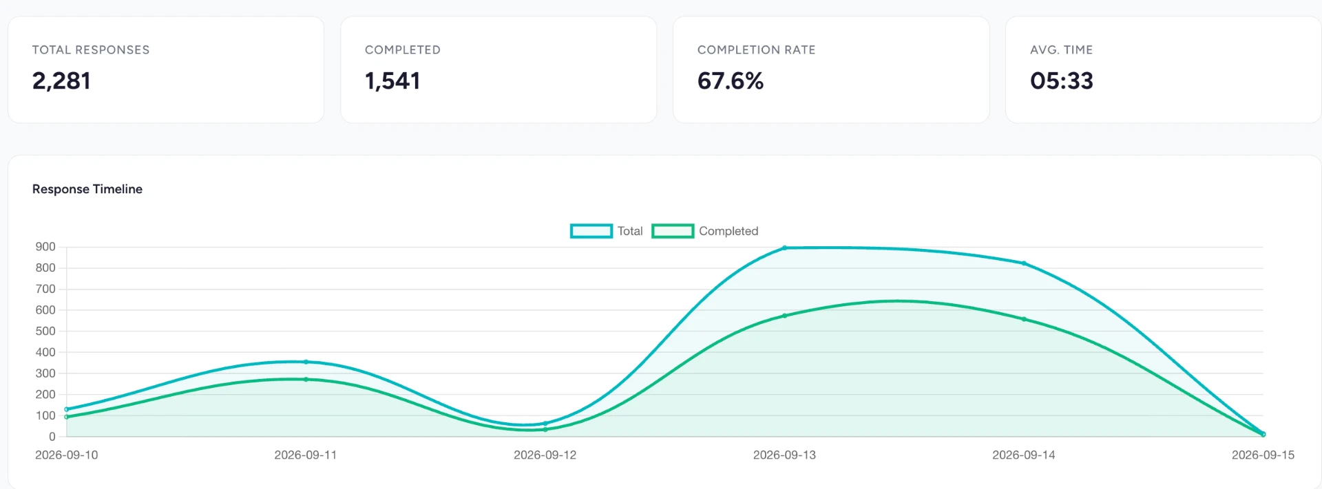
We can see responses accumulating throughout the fieldwork period, including total starts, completed surveys, completion rates and average response times.
This helps us monitor progress and quickly identify anything unusual as the sample builds.
Sample
Understand the sample
Survey responses can be viewed in a number of ways, helping us understand how the sample is taking shape while fieldwork is underway.
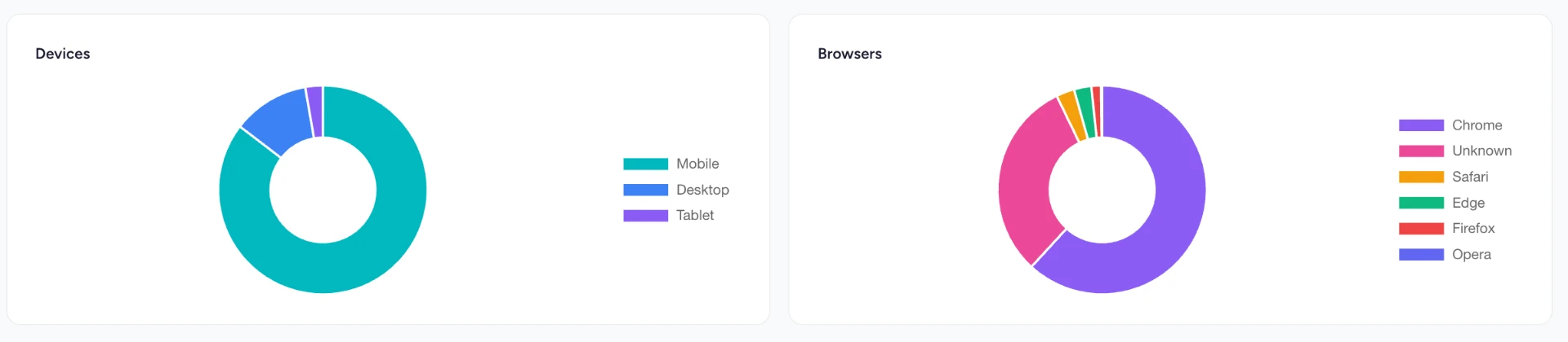
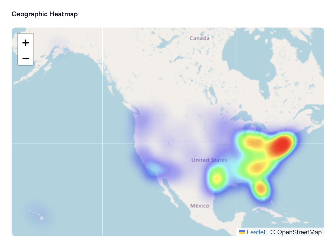
Geographic distribution provides an immediate visual indication of where respondents are located, while device and browser data provides additional information about how people are completing the survey.
Respondent behaviour
Monitor respondent behaviour
Completion isn’t the only thing that matters.
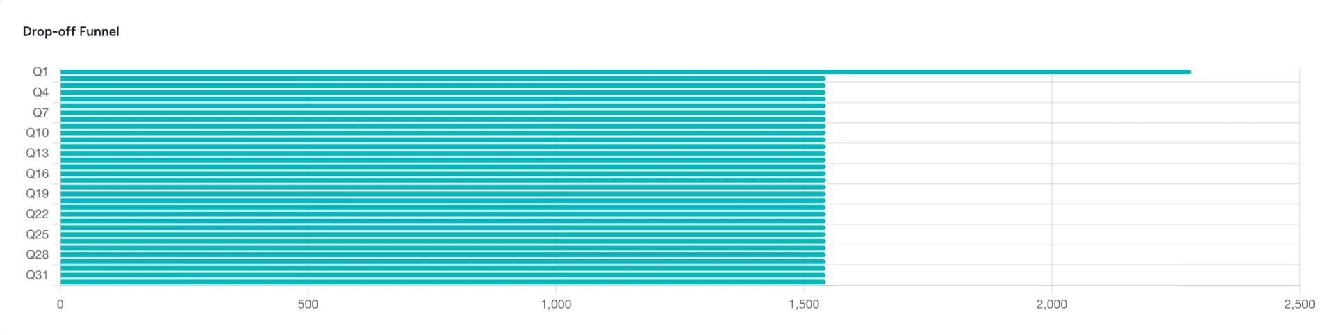
Our survey tools allow us to see how respondents progress through a questionnaire and where drop-off occurs. If a particular question appears to be causing friction, it becomes immediately visible.
Results
See every answer taking shape
As responses arrive, each question develops its own breakdown showing the number and percentage of respondents selecting each answer.
That means we can start identifying interesting findings, strong contrasts and potential story angles even while fieldwork is still underway.
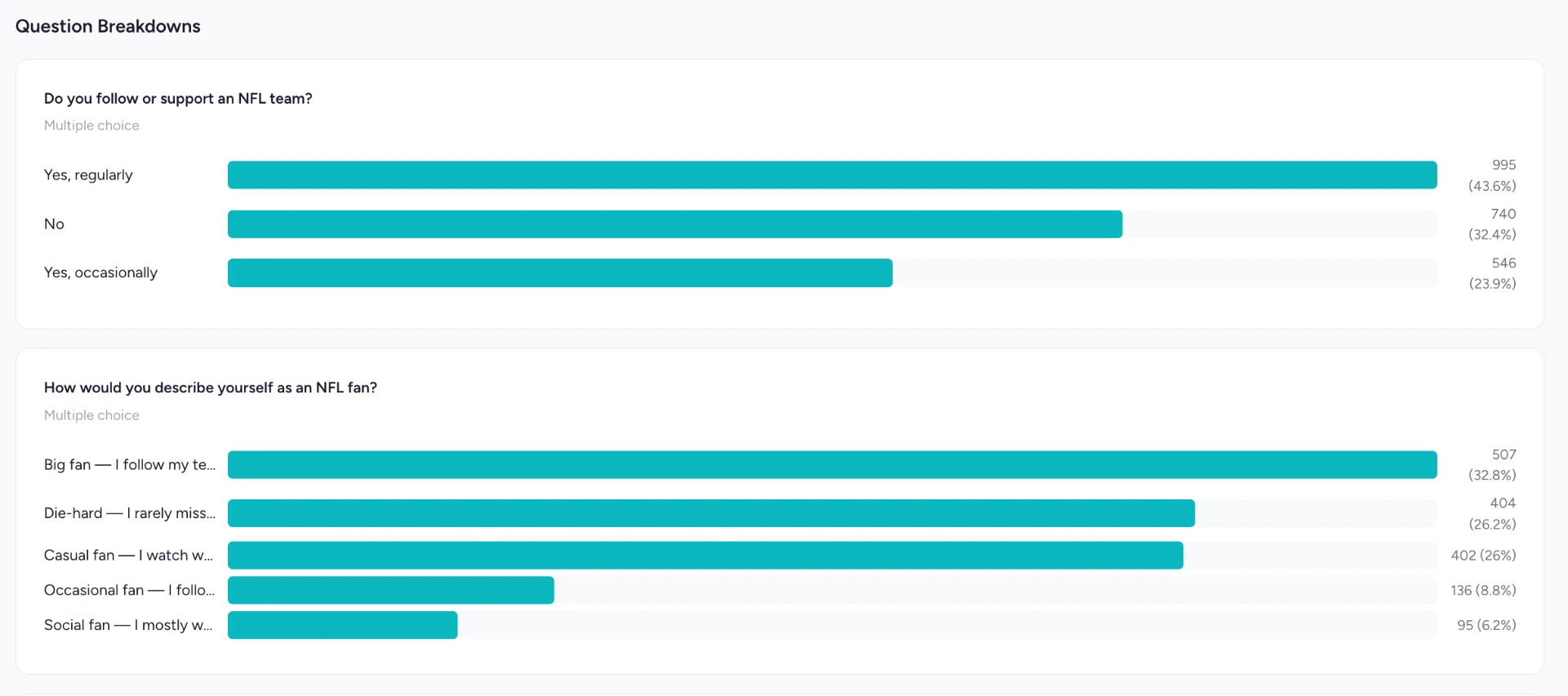
Example survey data shown for illustration.
Analysis
Go beyond the headline result
Individual answers are only the starting point.
Crosstab analysis allows us to compare one response against another and uncover differences between groups - for example, how attitudes vary by age, gender, geography, profession or another answer given elsewhere in the survey.
That’s often where the most interesting findings are hiding.

The outcome
From responses to usable data
Once fieldwork is complete, the result isn’t simply a collection of answers. It’s a structured dataset that can be analysed, segmented and turned into statistics suitable for PR campaigns, content, market research and customer insight.
This is what survey research looks like before the headline gets written.